-
Train Test data distribution(Covariate Shift) - 1ML, DL & Python/Train Test Distribution 2020. 11. 29. 15:39
이번에 다뤄볼 내용은 ML,DL관련 대회에서 자주 등장하지는 않지만 분석을 진행하기 전에 꼭 확인해야할 사항으로 학습셋과 테스트셋의 분포가 다른 것에서 올 수 있는 문제점과 다른 분포(dissimilar)를 사전에 체크할 수 있는 방법론에 대하여 다뤄보겠습니다.
분포가 다르다는 것은 어떤 것을 의미할까요?
저희가 예측하고자 하는 본질을 알고 계시다면 위의 질문에 대한 답이 쉽게 도출될 것입니다. 저희가 예측하고자 하는 것은 학습셋을 8:2 분할, 7:3분할 과정을 거쳐서 만든 테스트셋? 아니면 검증셋(validation)? 이것일까요?
아닙니다. 저희는 real world 데이터 즉, 실제 사용되고 활용되어야 할 데이터 여기서는 학습셋을 분할한 테스트 데이터가 아닌 진짜 테스트 데이터셋을 말합니다.
그러면 왜 실제 데이터를 예측하는데 학습셋과 테스트셋의 분포를 비교하는 것일까요?
만약 저희가 A라는 모델을 만들었다고 가정해보겠습니다. A라는 모델을 만들기 위해서는 학습셋에서 어느정도 검증을 거쳐서 만든 모델일 것입니다. 다행히도 현재 분석을 맡은 데이터는 train과 test 데이터간의 분포상 괴리가 없지만, train과 test 데이터의 분포가 다르다면? 현재 A라는 모델은 train에 최적화된 모델이기 때문에 test셋에서의 성능이 떨어질 수밖에 없습니다. train에서 성능이 좋았지만 test에서 성능이 떨어지는 것을 저희는 overfitting라고 정의하는데, 이 부분은 좀 다르게 정의하기도 합니다. 즉, 분포가 다른 것에서 오는 성능저하이기 때문에 Covariate shift라고 말하기도 합니다.
그럼 이와 같은 dissimilar을 해결하려면 어떻게 해결해야할까요?
답은 매우 심플한데, 극단적으로 분포가 다른 변수를 제거하거나 아니면 train, test간의 input변수의 분포를 맞춰주는 과정을 거칩니다.
자 그럼 이렇게 train, test셋의 분포가 다른 것을 체크할 수 있는 방법론과 해결하는 과정을 두 파트로 나눠서 진행해보겠습니다.
1. 데이터 전처리
해당 과정을 보여드리기 위해서 kaggle의 "Santander Value Prediction Challenge" 대회 데이터를 활용해보겠습니다.
www.kaggle.com/c/santander-value-prediction-challenge/data
먼저 중복되는 변수와 이상치 처리를 위한 과정을 거칩니다.
그리고 train, test데이터를 병합하여 하나의 데이터셋으로 구축하고 추후에 모델링과 변수별로 탐색시에 구분을 필요로 하기 때문에 index만 저장해놓습니다.
SAMPLE_SIZE = 4459

# Read train and test files
train_df = pd.read_csv('santander-value-prediction-challenge/train.csv').sample(SAMPLE_SIZE)
test_df = pd.read_csv('santander-value-prediction-challenge/test.csv').sample(SAMPLE_SIZE)

# Get the combined data
total_df = pd.concat([train_df.drop('target', axis=1), test_df], axis=0).drop('ID', axis=1)

# Columns to drop because there is no variation in training set
# train, test 병합
zero_std_cols = train_df.drop("ID", axis=1).columns[train_df.std() == 0]
total_df.drop(zero_std_cols, axis=1, inplace=True)
print(f">> Removed {len(zero_std_cols)} constant columns")

# Removing duplicate columns
# Taken from: https://www.kaggle.com/scirpus/santander-poor-mans-tsne
colsToRemove = []
colsScaned = []
dupList = {}
columns = total_df.columns
for i in range(len(columns)-1):
    v = train_df[columns[i]].values
    dupCols = []
    for j in range(i+1,len(columns)):
        if np.array_equal(v, train_df[columns[j]].values):
            colsToRemove.append(columns[j])
            if columns[j] not in colsScaned:
                dupCols.append(columns[j])
                colsScaned.append(columns[j])
                dupList[columns[i]] = dupCols
colsToRemove = list(set(colsToRemove))
total_df.drop(colsToRemove, axis=1, inplace=True)
print(f">> Dropped {len(colsToRemove)} duplicate columns")

# Go through the columns one at a time (can't do it all at once for this dataset)
total_df_all = deepcopy(total_df)
for col in total_df.columns:

    # 3 * 표준편차를 통해서 데이터 99% 밖에 있는 이상치를 제거
    data = total_df[col].values
    data_mean, data_std = np.mean(data), np.std(data)
    cut_off = data_std * 3
    lower, upper = data_mean - cut_off, data_mean + cut_off
    outliers = [x for x in data if x < lower or x > upper]

    # If there are crazy high values, do a log-transform
    if len(outliers) > 0:
        non_zero_idx = data != 0
        total_df.loc[non_zero_idx, col] = np.log(data[non_zero_idx])

    # Scale non-zero column values
    nonzero_rows = total_df[col] != 0
    total_df.loc[nonzero_rows, col] = scale(total_df.loc[nonzero_rows, col])

    # Scale all column values
    total_df_all[col] = scale(total_df_all[col])
    gc.collect()

# 후에 train, test 분할하는 과정에서 필요한 인덱스 저장
train_idx = range(0, len(train_df))
test_idx = range(len(train_df), len(total_df))
자 이제 분포를 확인하기 위한 사전 준비를 마쳤으니 본격적으로 분포를 확인해보겠습니다.
2. PCA를 통한 확인
PCA 는 대표적인 차원축소 방법으로, 차원축소시에 데이터 손실을 최대한 막기 위해서 분산을 최대화하면서 차원을 축소하는 방법론입니다. 즉, 저희는 분석하거나 모델링을 수행할 때 변수가 매우 많은 데이터라면(현재 시행하고 있는 이 데이터) 차원 축소를 통해서 모든 변수를 이용하지 않고도 충분히 원 데이터 상태의 분석을 수행할 수 있습니다.
PCA와 관련한 용어들과 직관적인 설명이 필요하신 분들은 다음의 링크를 참고해주시면 됩니다!
https://www.youtube.com/watch?v=DUJ2vwjRQag
# pca 함수
def test_pca(data, create_plots=True):
    """Run PCA analysis, return embedding"""

    # Create a PCA object, specifying how many components we wish to keep
    # 주성분의 갯수는 1000개
    pca = PCA(n_components=1000)

    # Run PCA on scaled numeric dataframe, and retrieve the projected data
    pca_trafo = pca.fit_transform(data)

    # The transformed data is in a numpy matrix. This may be inconvenient if we want to further
    # process the data, and have a more visual impression of what each column is etc. We therefore
    # put transformed/projected data into new dataframe, where we specify column names and index
    pca_df = pd.DataFrame(
        pca_trafo,
        index=total_df.index,
        columns=["PC" + str(i + 1) for i in range(pca_trafo.shape[1])]
    )

    # Only construct plots if requested
    if create_plots:

        # Create two plots next to each other
        _, axes = plt.subplots(2, 2, figsize=(20, 15))
        axes = list(itertools.chain.from_iterable(axes))

        # Plot the explained variance# Plot t
        axes[0].plot(
            pca.explained_variance_ratio_, "--o", linewidth=2,
            label="Explained variance ratio"
        )

        # Plot the cumulative explained variance
        axes[0].plot(
            pca.explained_variance_ratio_.cumsum(), "--o", linewidth=2,
            label="Cumulative explained variance ratio"
        )

        # Show legend
        axes[0].legend(loc="best", frameon=True)

        # Show biplots
        for i in range(1, 4):

            # Components to be plottet
            x, y = "PC"+str(i), "PC"+str(i+1)

            # Plot biplots
            settings = {'kind': 'scatter', 'ax': axes[i], 'alpha': 0.2, 'x': x, 'y': y}
            pca_df.iloc[train_idx].plot(label='Train', c='#ff7f0e', **settings)
            pca_df.iloc[test_idx].plot(label='Test',  c='#1f77b4', **settings)

        # Show the plot
        plt.show()

    return pca_df
# 각 주성분별로 좌표에 뿌려져 있는 분포 확인 # Run the PCA and get the embedded dimension pca_df = test_pca(total_df) pca_df_all = test_pca(total_df_all, create_plots=False)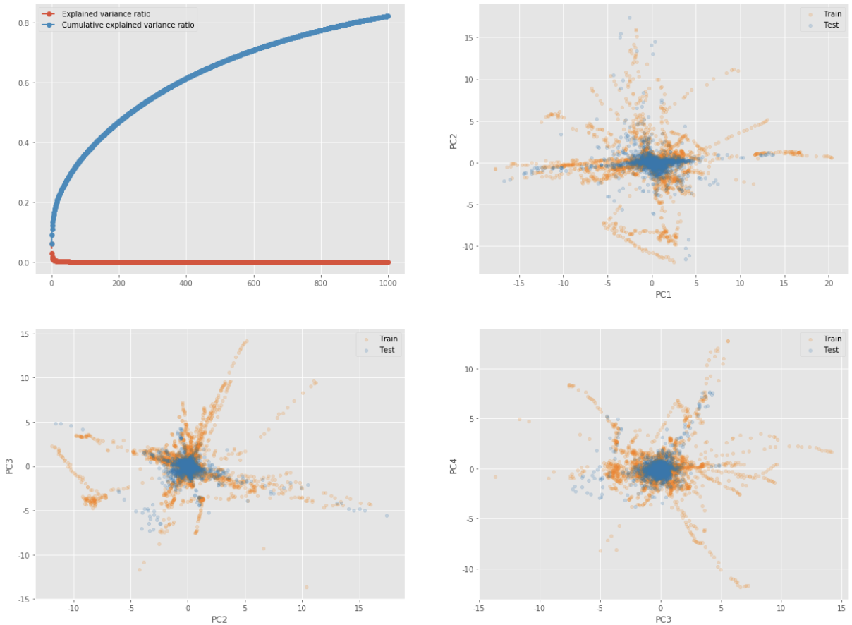
위의 시각화 결과를 간단하게 살펴보아도 train과 test의 분포가 상당히 다른 것을 확인할 수 있습니다.
testset은 비교적 중심에 뭉쳐있는 분포를 띄고 있지만 trainset은 굉장히 발산하고 있는 분포를 띄고 있는 것을 확인할 수 있습니다.
여기 아래의 또다른 시각화는 train과 test의 분포가 비슷할 때의 결과를 보여주는 시각화입니다. 위의 결과와 비교해서 보시면 좋을 것 같습니다.
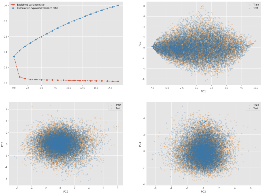
어느 하나의 데이터셋도 발산하거나 수렴하는 형태를 보이고 있지 않으며 골고루 퍼져 있는 형태의 분포를 띄고 있는 것을 알 수 있습니다.
하지만 PCA는 차원축소를 진행할 때 선형 분석 방법론을 활용하여 데이터가 지니고 있는 군집의 특성은 무시한 상태에서 축소를 진행하기 때문에 데이터 내에 있는 군집의 특성이 반영되지 않을 수 있습니다. 그래서 이번엔 군집의 특성을 반영한 T-sne 방법을 통해서 확인해보겠습니다.
3. T-sne를 통한 확인
t-sne는 차원축소를 진행할 때 각 데이터가 지니고 있는 군집의 특성을 반영할 수 있는데, 군집의 특성을 반영하기 위해서 t분포를 사용합니다. 간단하게만 말하자면, 각 군집을 구한 뒤 군집별로 랜덤하게 데이터 좌표를 잡고 가 중심 좌표를 t분포상의 중심으로 가정한 뒤 주변의 데이터들간의 거리를 t분포로 표현합니다. 그래서 군집을 보존할 수 있게 됩니다.
def test_tsne(data, ax=None, title='t-SNE'):
    """Run t-SNE and return embedding"""

    # Run t-SNE
    tsne = TSNE(n_components=2, init='pca')
    Y = tsne.fit_transform(data)

    # Create plot
    for name, idx in zip(["Train", "Test"], [train_idx, test_idx]):
        ax.scatter(Y[idx, 0], Y[idx, 1], label=name, alpha=0.2)
        ax.set_title(title)
        ax.xaxis.set_major_formatter(NullFormatter())
        ax.yaxis.set_major_formatter(NullFormatter())
    ax.legend()
    return Y

# Run t-SNE on PCA embedding
# PCA 차원에 임베딩된 데이터를 활용한 t-sne수행
_, axes = plt.subplots(1, 2, figsize=(20, 8))

tsne_df = test_tsne(
    pca_df, axes[0],
    title='t-SNE: Scaling on non-zeros'
)
tsne_df_unique = test_tsne(
    pca_df_all, axes[1],
    title='t-SNE: Scaling on all entries'
)

plt.axis('tight')
plt.show()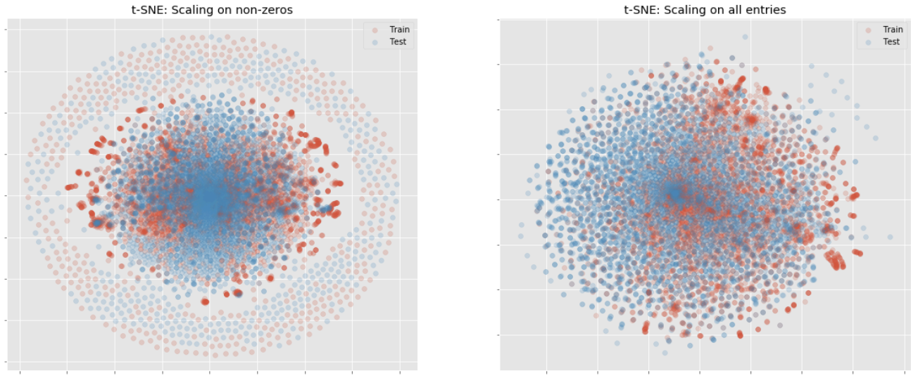
t-sne로도 pca와 같은 결과가 나왔습니다.
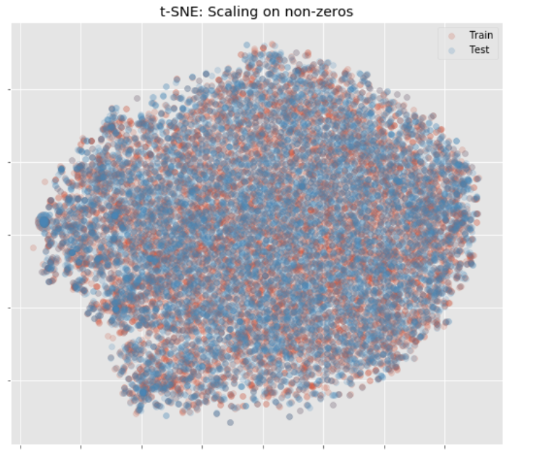
train, test의 분포가 상당히 다른 것을 확인할 수 있습니다. 아래는 마찬가지로 train과 test의 분포가 비슷할 때 볼 수 있는 t-sne의 분포 시각화입니다.
4. 다음 포스팅
다음 포스팅에서는 두 클래스(train, test)를 구분할 수 있는 classifier 모델을 직접 만든 후 두 클래스를 구분할 수 있는 input변수들이 존재하는지, 해당 input변수들을 어떻게 도출하는지, 어떻게 처리하는지 다양한 방법론을 활용하여 분석을 진행해보겠습니다.
*reference
www.kaggle.com/nanomathias/distribution-of-test-vs-training-data
*code
minyong-shin/blog-code-storage
블로그에서 분석한 코드를 정리한 저장소입니다. Contribute to minyong-shin/blog-code-storage development by creating an account on GitHub.
github.com
'ML, DL & Python > Train Test Distribution' 카테고리의 다른 글
Train Test data distribution(Covariate Shift) - 2 (0) 2020.11.29